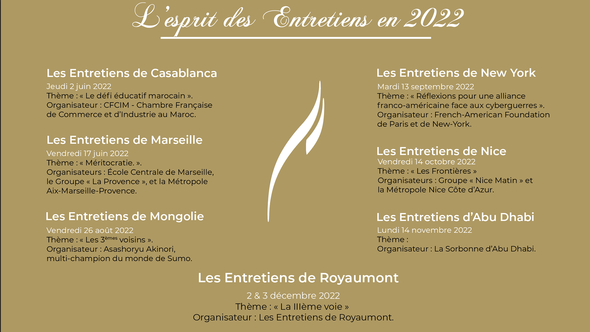
Context
Les Entretiens de Royaumont is a forum where individuals can discuss and propose ideas about how French society can progress and evolve. It provides a space for people to share their perspectives and insights on various topics such as technology, politics, economics, and culture. I worked as a graphic, motion designer, and social media manager during my apprenticeship there.
The Brand Identity was not accurately shown then, from the erroneous color codes to the logo's limited use. The goal was not to redo everything about the identity of Les Entretiens de Royaumont but to update and polish it.
We achieved tremendous growth online, of over 22% regarding followers and interactions across social media platforms. We also consistently reached the first triple-digit liked content on Instagram (203) from the brand, which initially struggled to hit double-digit numbers.
Process
Modernizing the digital image of Les Entretiens de Royaumont was my primary mission. I started working on the digital content posted on social media.
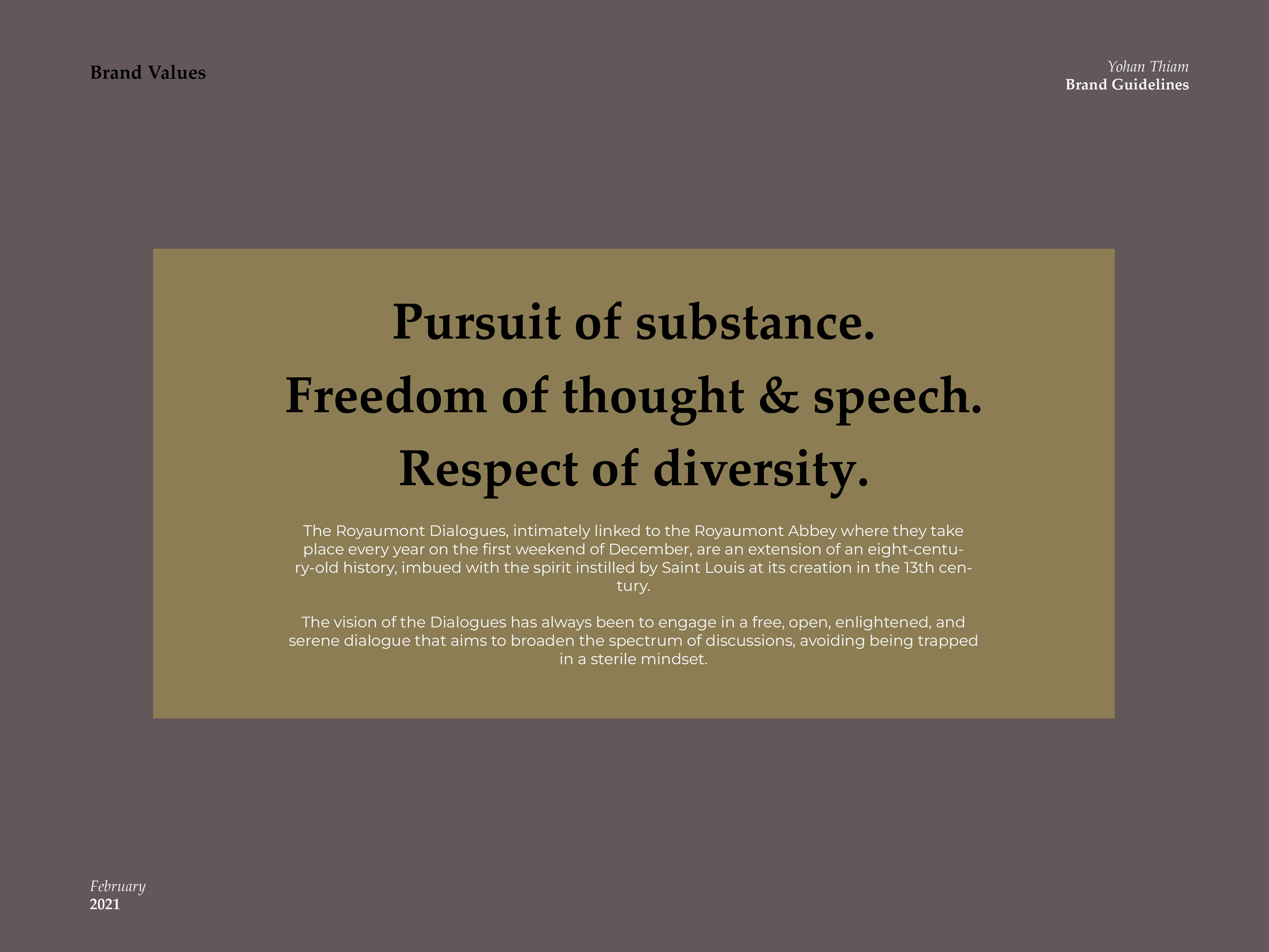
Upon realizing that the Brand Guidelines needed improvement as it only had a color palette. The team was small, 4 in total, and I worked on the design part of the company alone. I took the initiative to discuss this topic with the owner, who would veto or pass anything produced by anyone in the association. The first step was to examine the brand's values and how he would describe them.
Thanks to his feedback, I could start building a direction for the brand to advance without changing what made Les Entretiens de Royaumont's unique. We stayed in contact during the entire process.
Logo Evolution
As we approached the topic of modernizing and evolving this yearly forum's visual identity, I proposed moving toward an icon. A logo already existed and would be kept, but we needed to create an easily recognizable mark to adapt to what worked. The flame in the original logo was my selection. It is small but unique while being easy to adjust on different supports.
Having a variety of options would make creating and conceptualizing ideas easier. We could also brand reliably, as the flame had always been an under-utilized symbol.
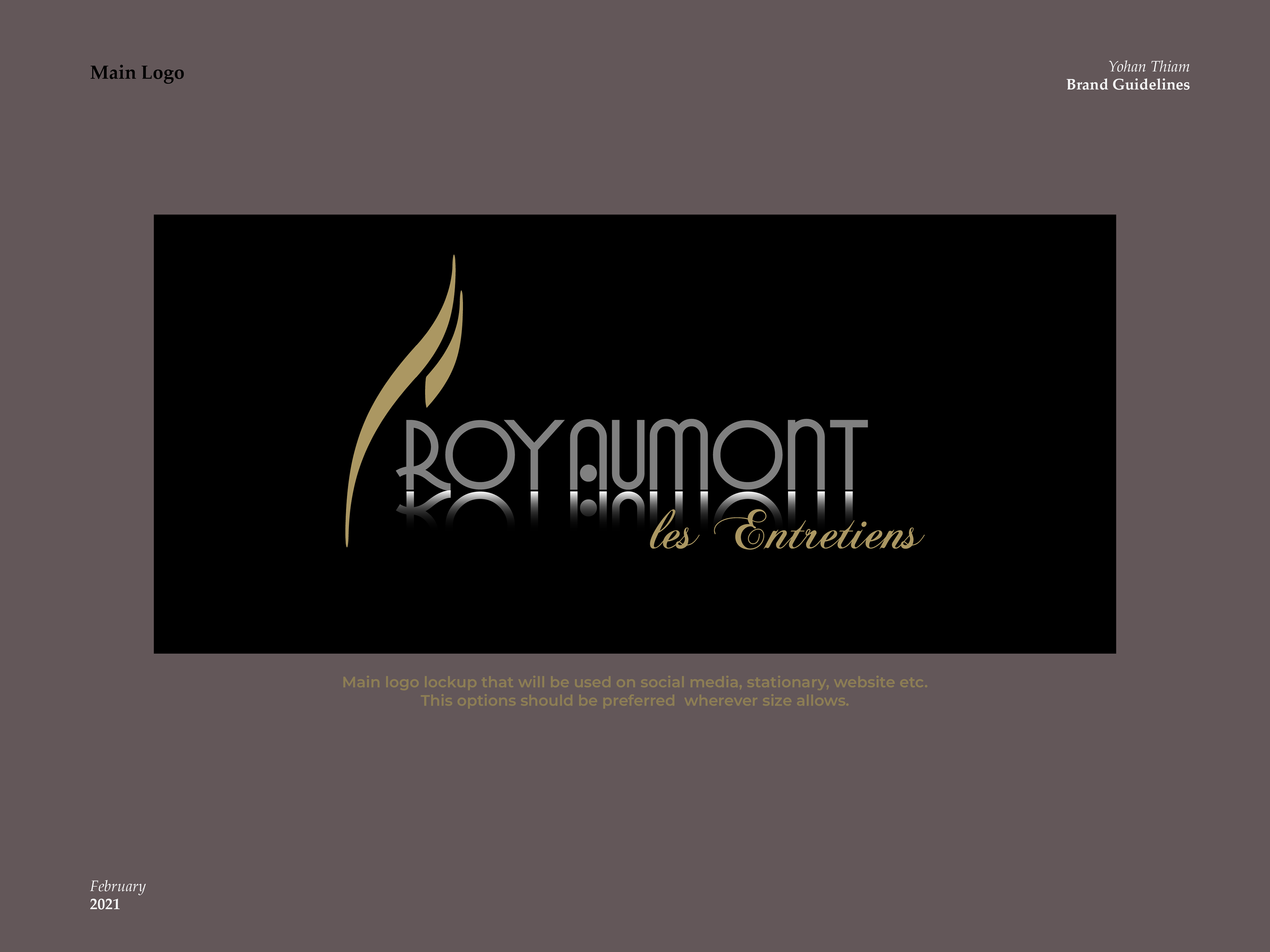

I also produced a 3D version of the logo used in video content for Les Entretiens de Royaumont.
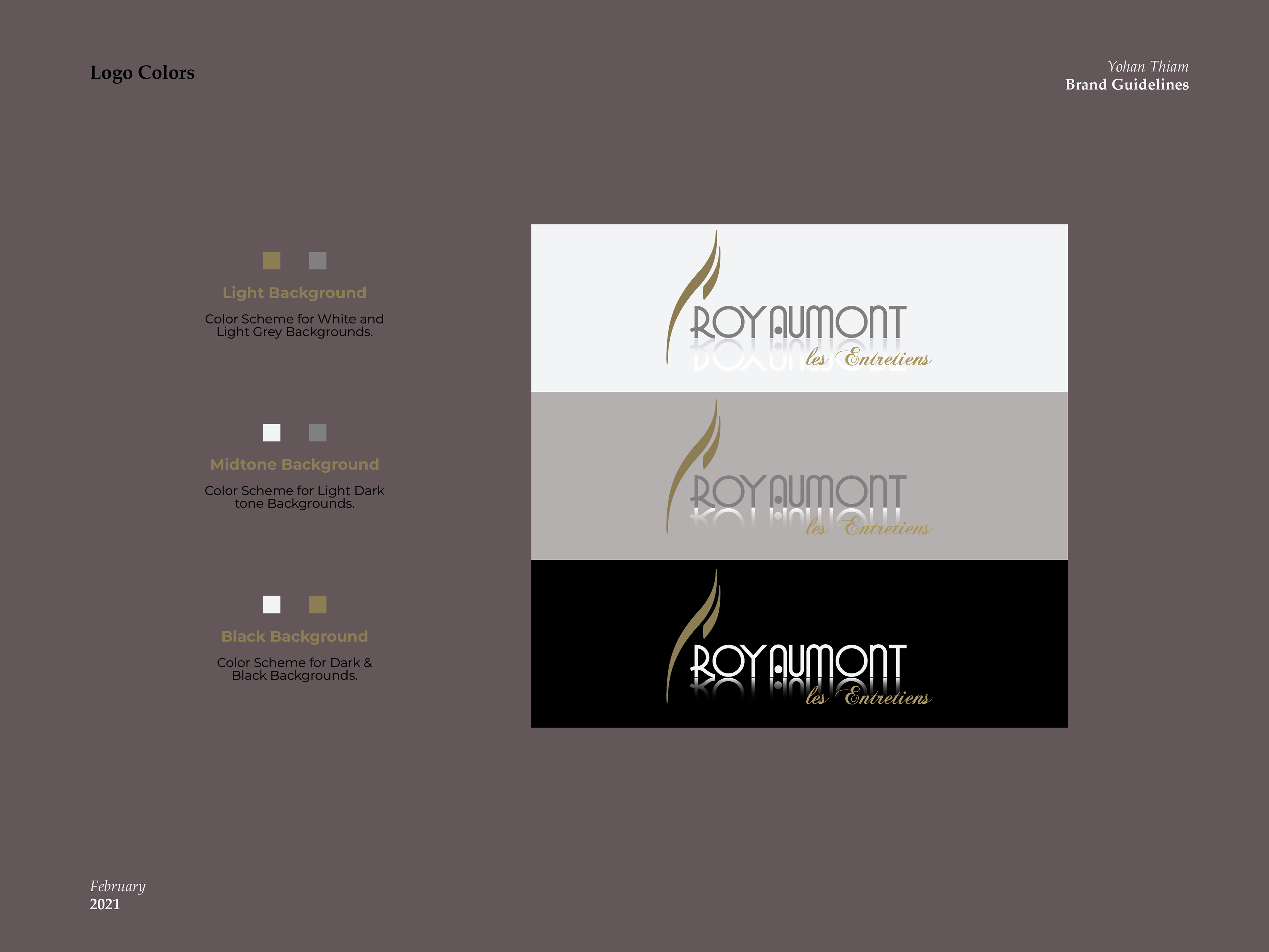
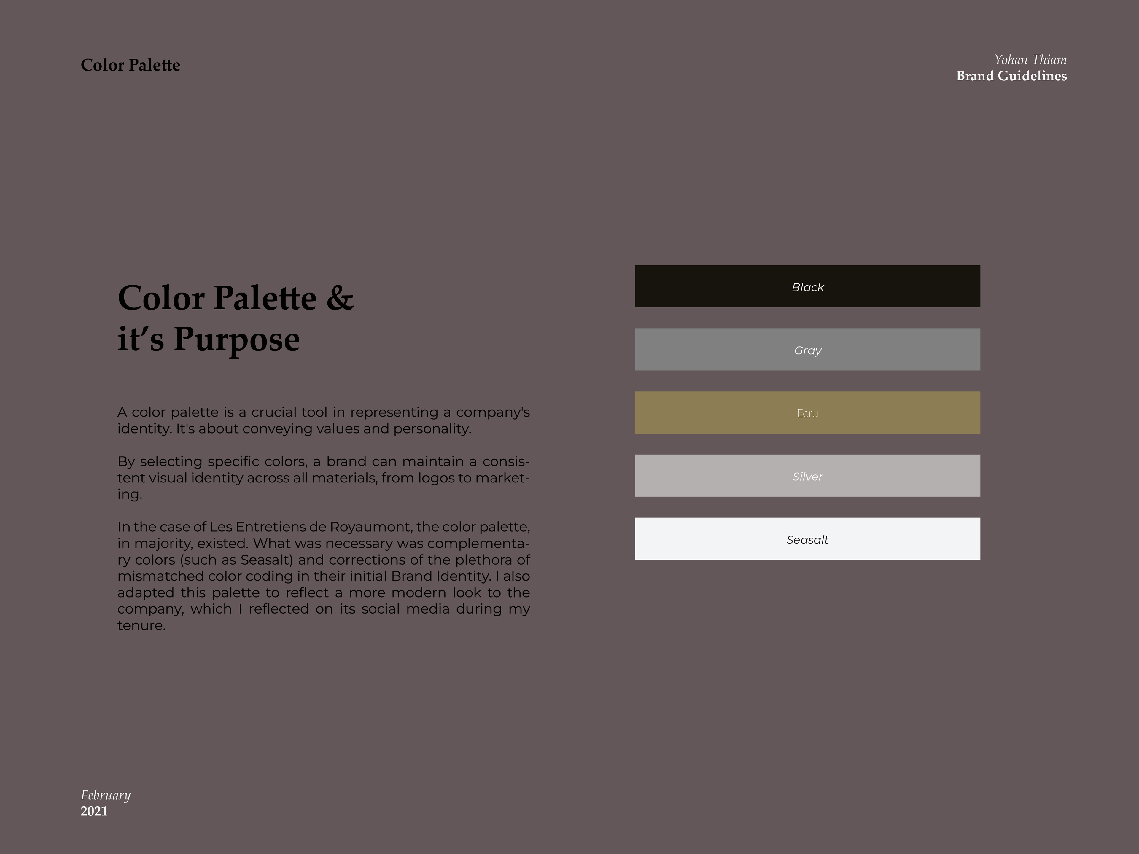
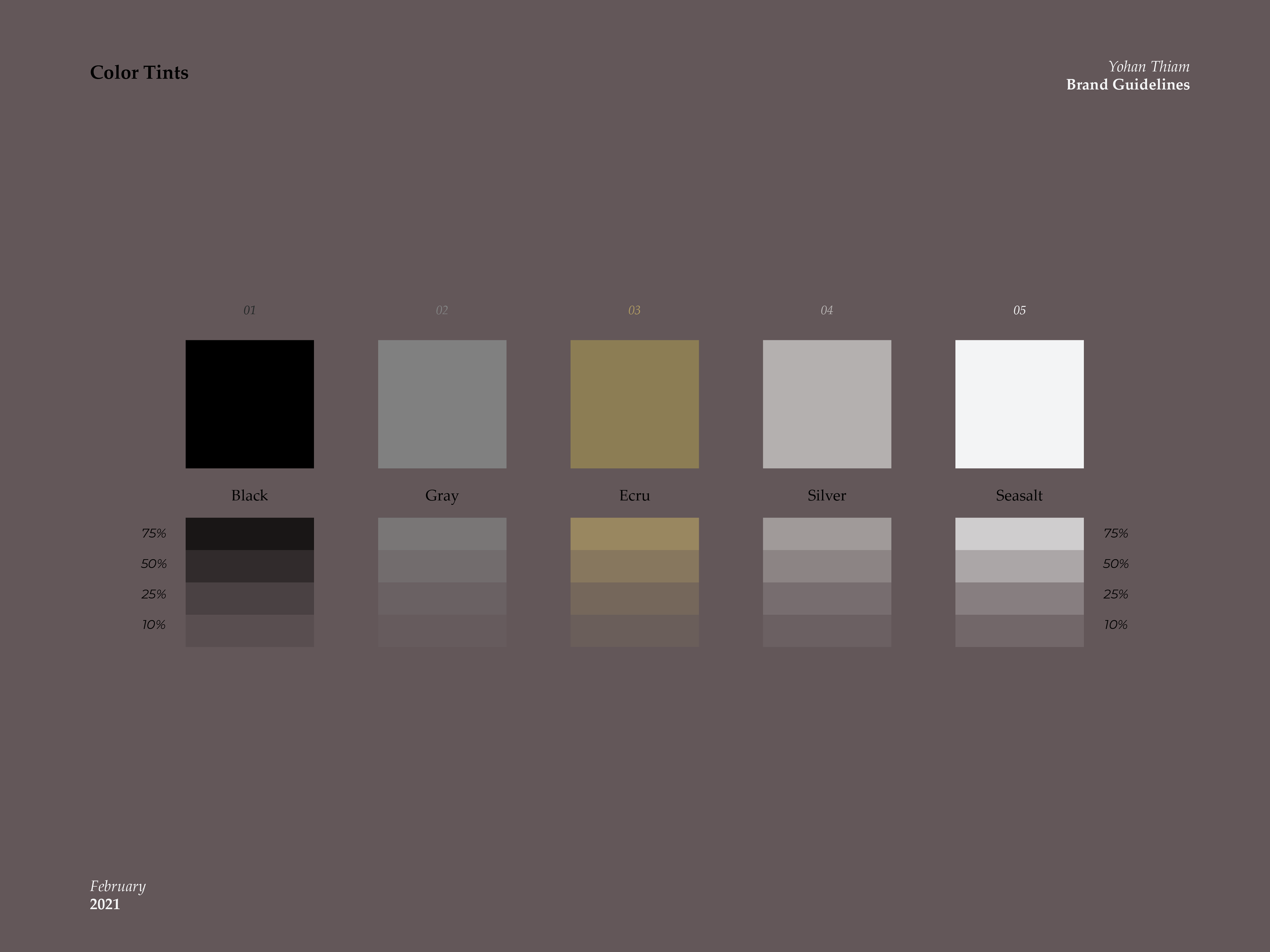
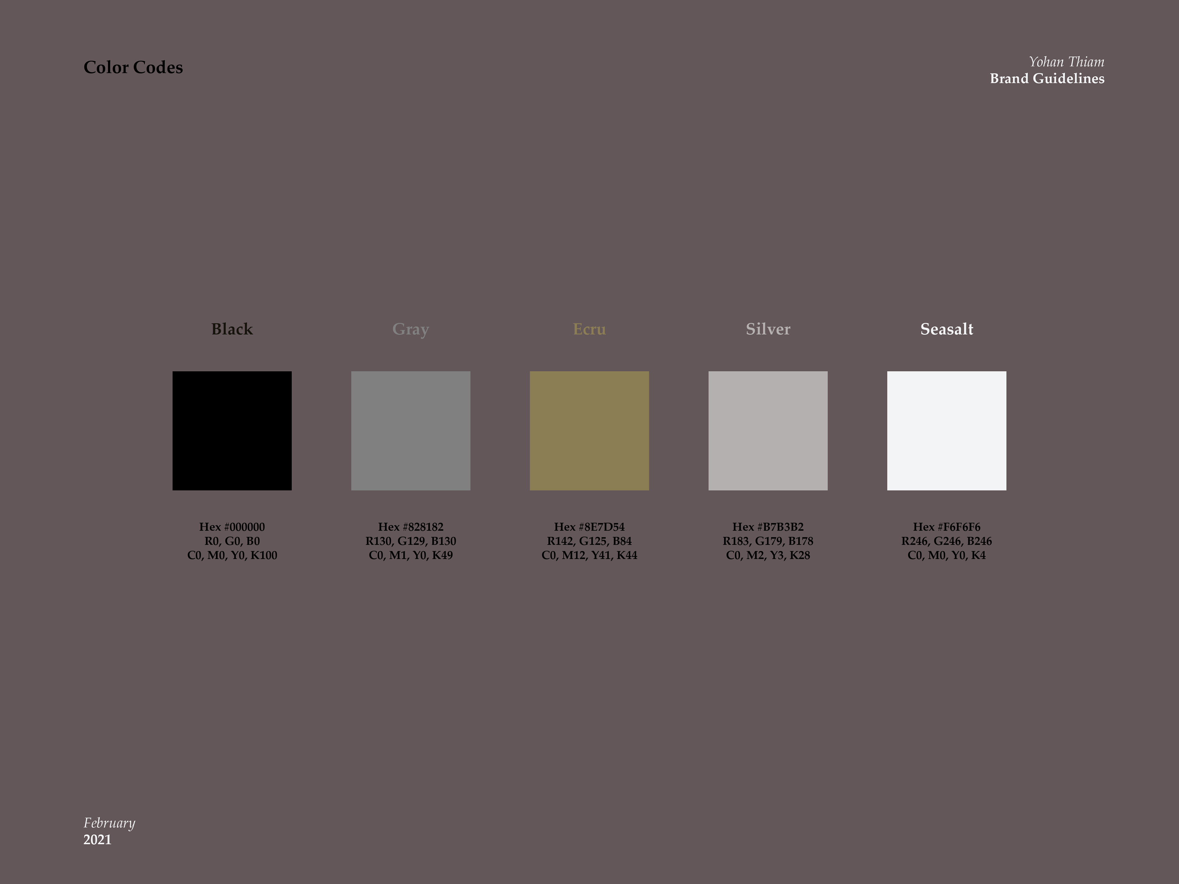
Color Palette
Les Entretiens de Royaumont already had a color palette of 3 colors: Black, Gray, and Ecru.
Seasalt, Silver, and Gray were added as complementary colors to allow more freedom to the design process without leaving the existing universe.
These tints could be used with varying opacities and in combination to allow more diversity to the content produced for future events.
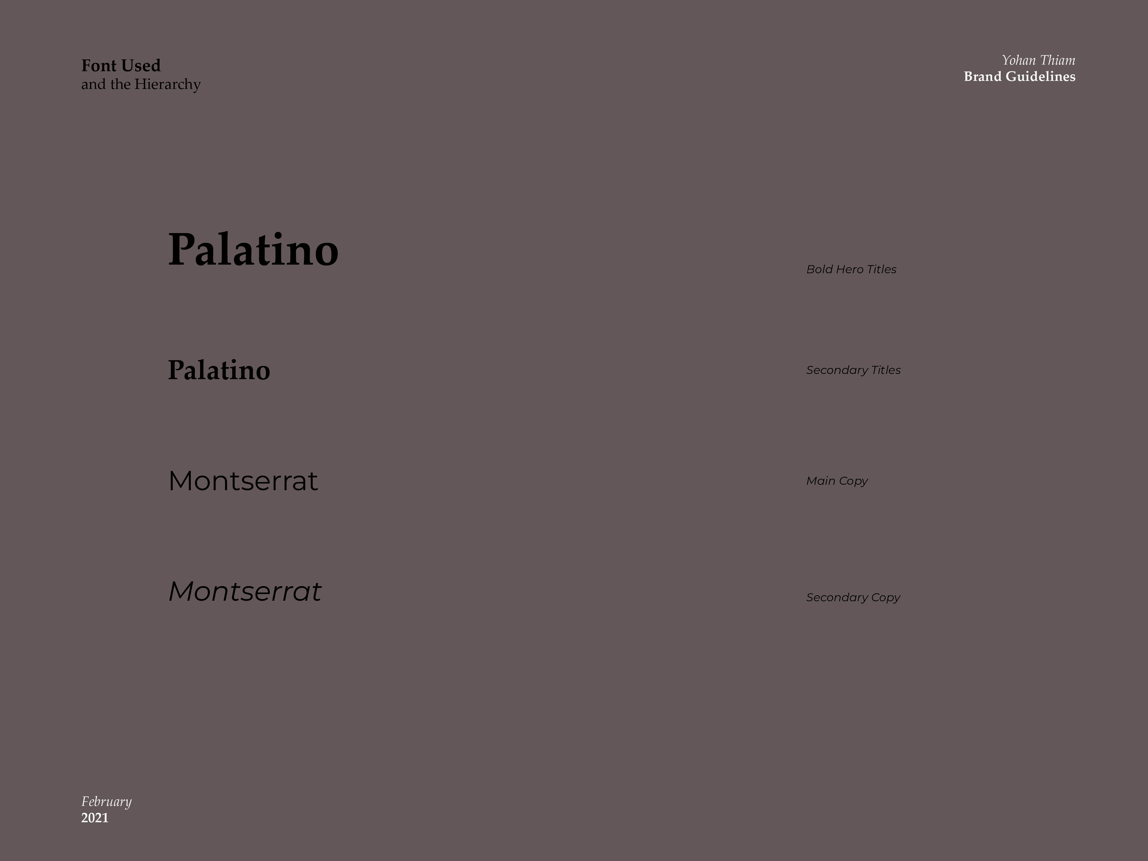
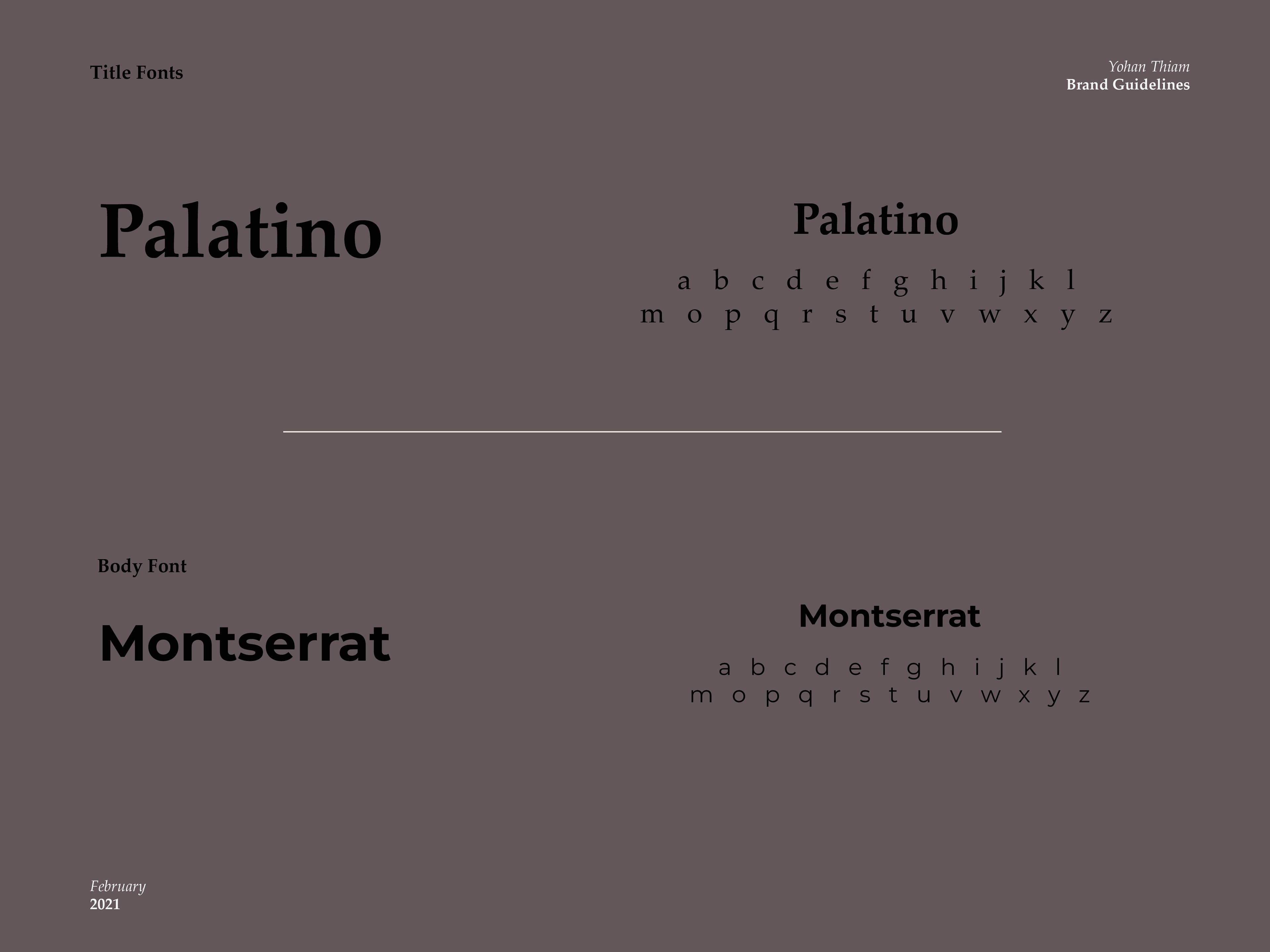
Font
Palatino was the existing font that was liked and recommended by the CEO. To add variety and a hierarchy to the content, I chose Montserrat, a simple but traditional font that is easily readable. While being a sans serif font, it highlighted the high-end feeling Palatino gave.
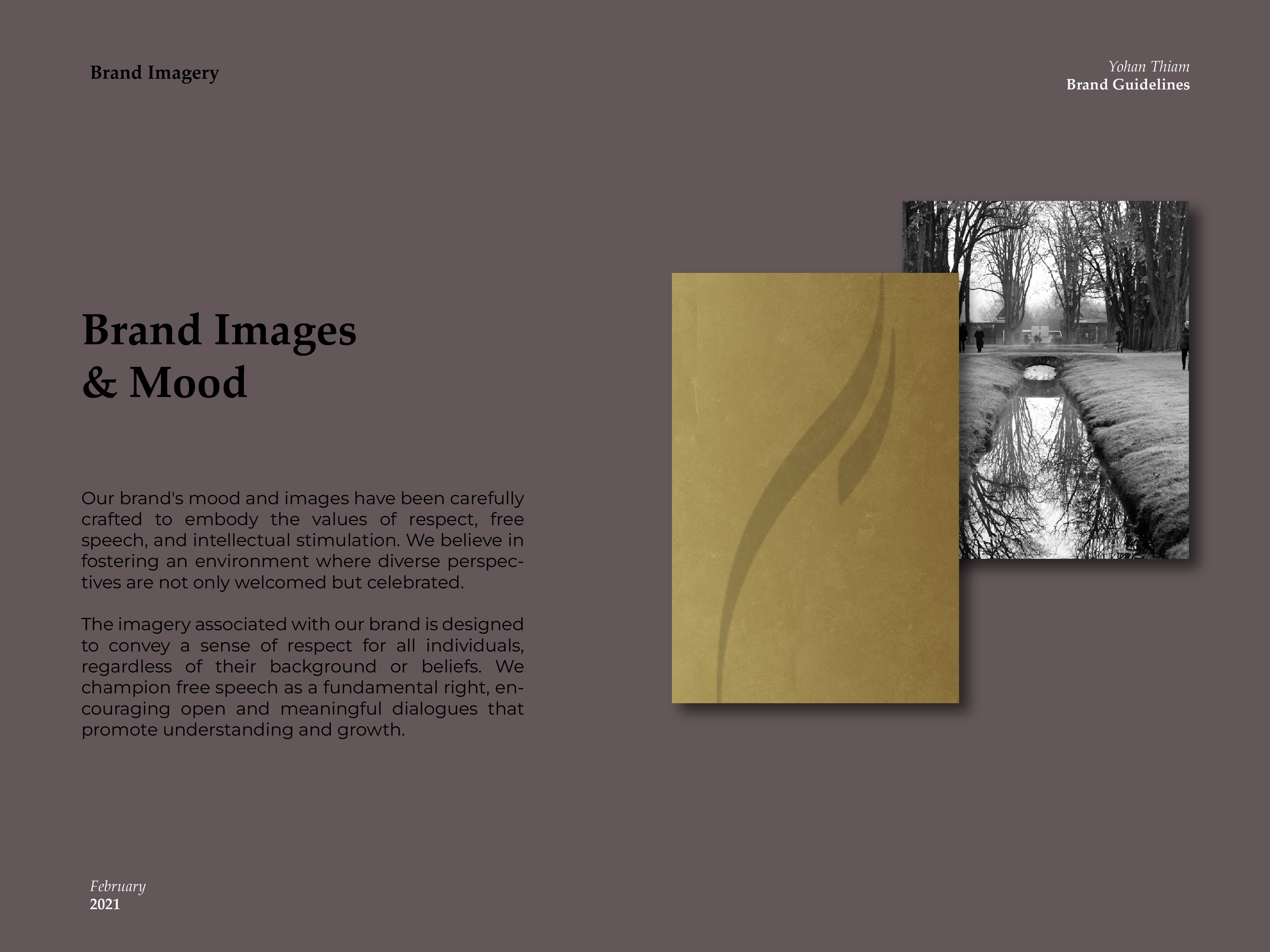
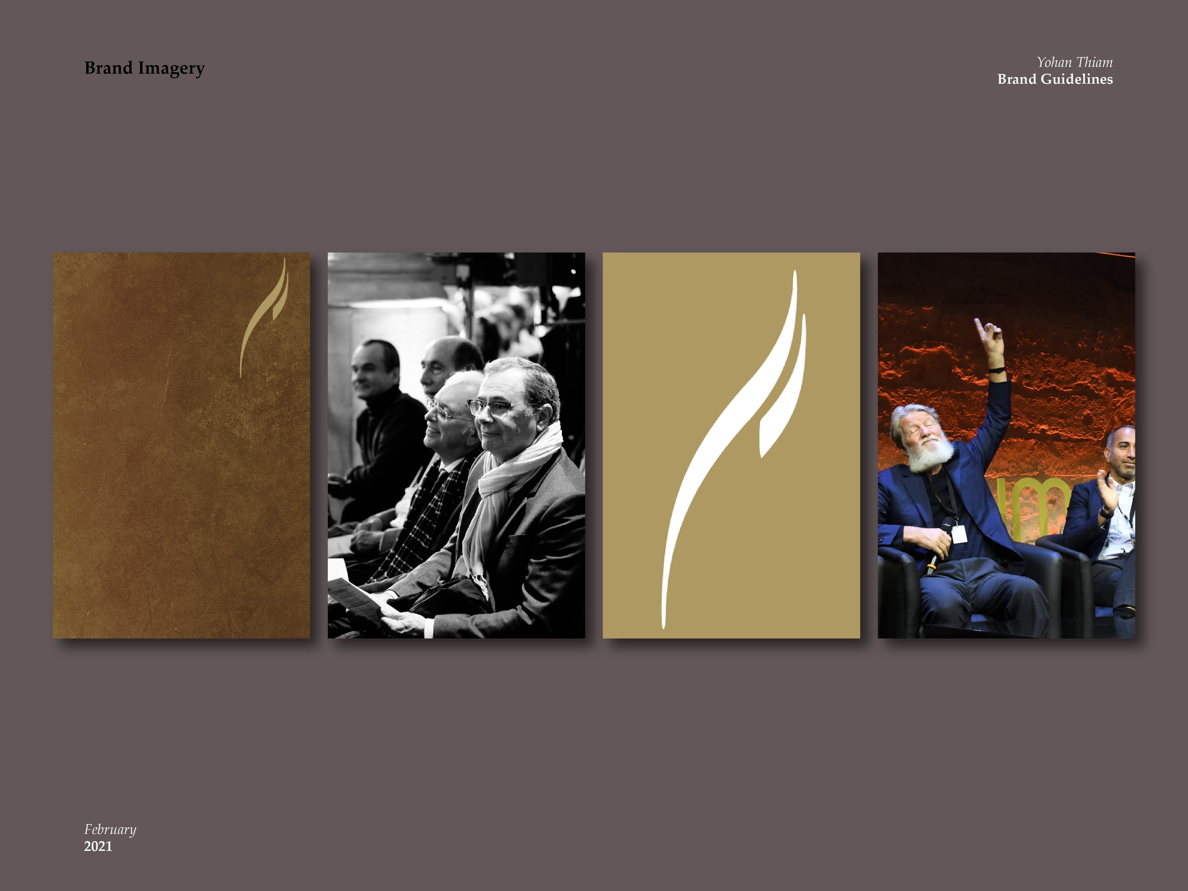
Digital & Print Imagery
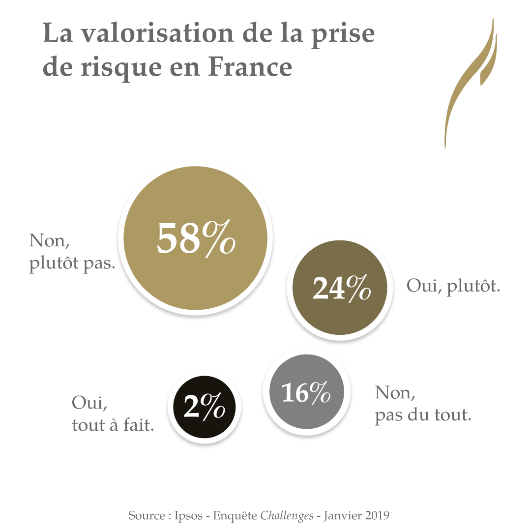
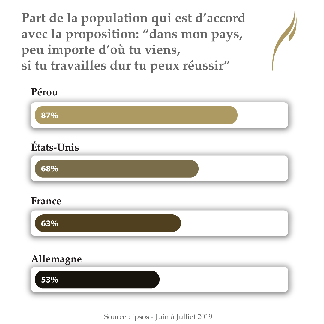
Les Entretiens de Royaumont relies on an image of quality, discussion, and questioning. I wanted to ensure that every concept, design, or post accurately represented these values. Be it digital or Print.


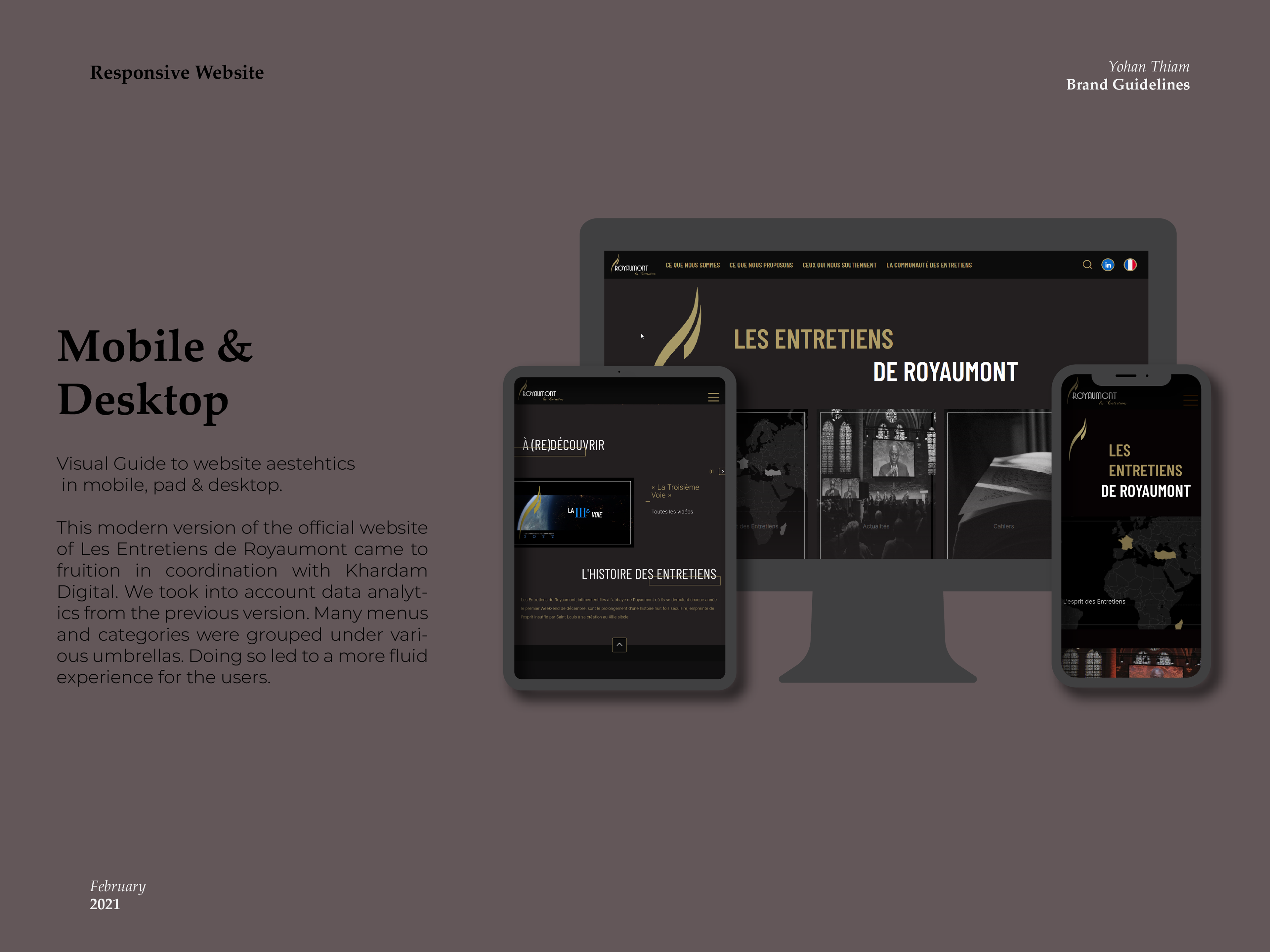
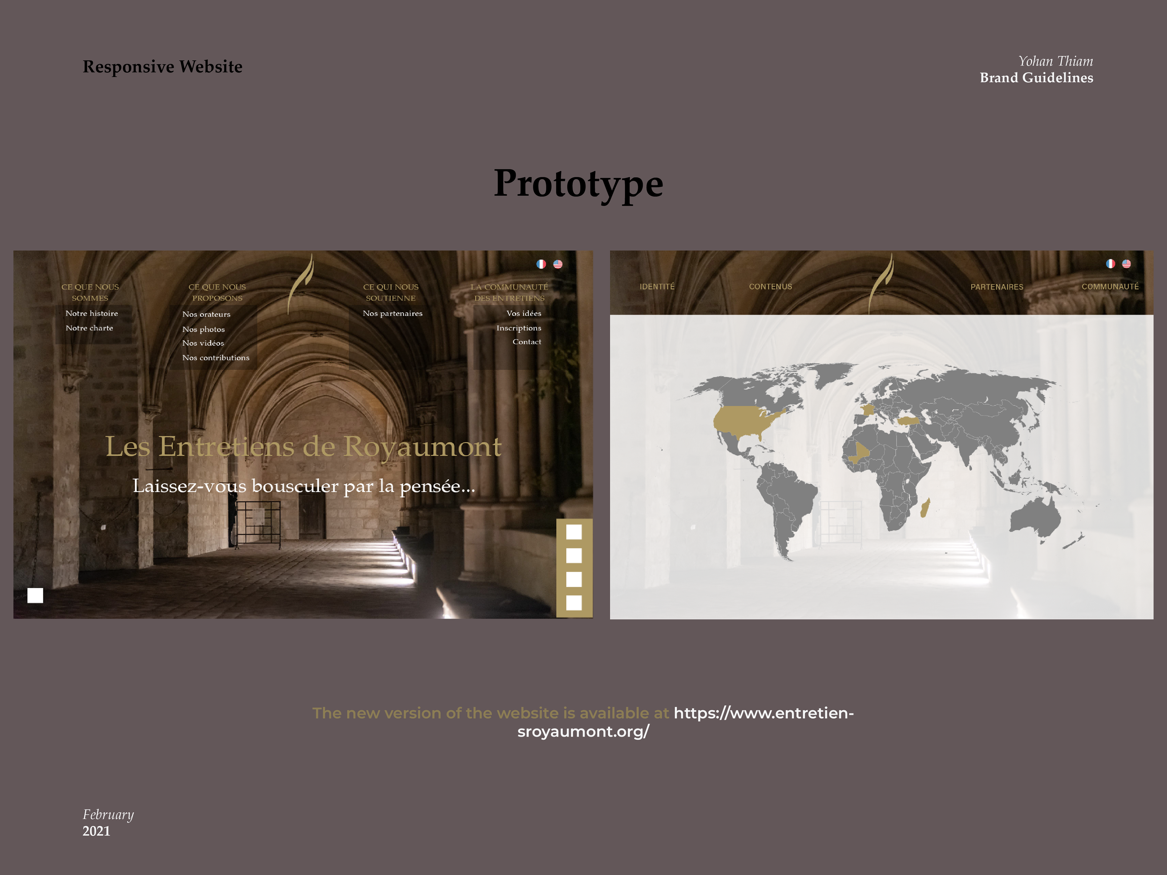
Website
Through our discussions, we also decided to improve the website and improve the translation of the said website from French to English. I also took care of that.
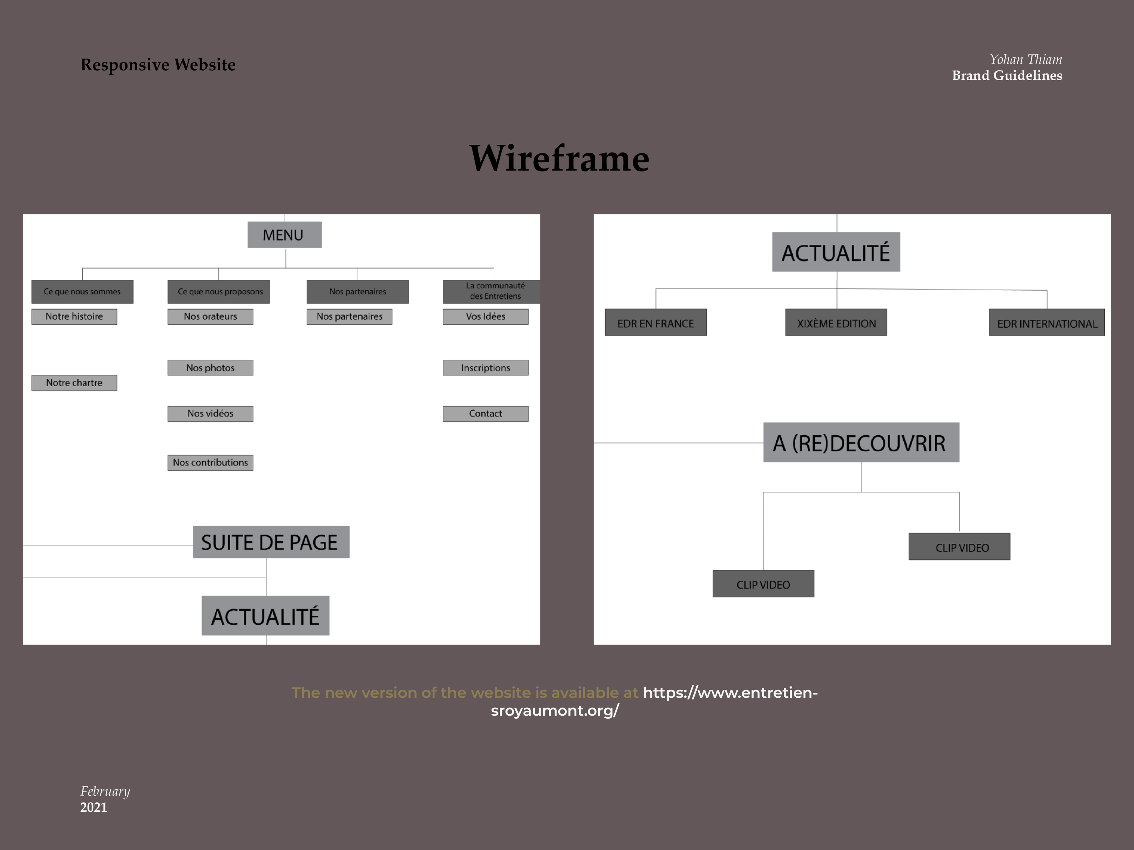
I worked on the translation with the Editorial head of Les Entretiens de Royaumont. The director of Partnership and Press relations and I executed the brainstorming of the website. I worked on the wireframe, the overall design, changes to the UX, and regrouping of the content. My colleague complimented the project regarding naming sections of the website.
However, we decided to do away with the mobile application that had been previously running but was unsuccessful in retaining users.
During that time, we were in constant discussion with Kardham Digital, who took care of applying and coding the website that is now visible and online to this day.