Self___ A look at the evolution of identity in these times of significant changes.
Context
This project started as a personal research into typography and layout design. As a designer, I spend a lot of time organizing typography around images. I wanted to study and implement varying layouts and types into a plan, with the pictures being the additional design elements.
I chose the theme of Self__ Identity, as it is a profoundly personal concept for me and many people in the current age. I have had struggles through life, especially with finding who I am. Societal and familial pressure permanently pushes us to have a solid grasp of that idea by a certain point in our lives. That incessant burden quickly leads to difficulties, loneliness, depression, and a constant feeling of loss.
Although this design focused on the technical aspects, I wanted to address themes that would reach a broader audience. That thought led me to understand that the text in the format is also essential and not simply filler. Taking my own experience with mental health, supported by discussions with peers, friends,, and people close to my age, I settled on four thematics related to Identity: Art, Diversity, Resilience,, and Technology.

Process
Although my own experience was necessary, I still wanted to research the perspective of Self and Identity. I got feedback from College students at Seton Hall University through a friend who holds the role of Director of Esports for the University.
I also surveyed previous colleagues and peers on the subject. I wanted to get keywords that would come back and help me illustrate this concept.
The words that consistently came back concerned the hardship, the outlets, and the pressure: Rushed, scared, art, gaming, technology, social media, tiredness, tenacity, time, family, society, shutting out, mental health, and permanent search.
Armed with all this information, I decided to start working on expressing some of these emotions and feelings without relying too deeply on images.
I chose one expressive color that wasn’t too saturated. Saffron is a soft color, not too saturated, often related to peace, wellness, relaxation, and traveling. Travel agencies commonly use this shade, but also in the business of luxury. Saffron created a perfect contrast by using white and black as core hues of the inward design of the book.
Fonts
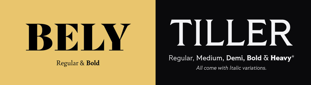
The main Title font selected is BELY, designed by Roxane Gataud, from TypeTogether. I wanted a solid type; this is a play on the concept that although Identity is not a tangible concept, society makes it seem as something that can be solidified.
TILLER, Designed by Brian Brubaker, From Fort Foundry, is the subheader, and body text font is the subheader and body text font. It is a serif type and thus still keeps a degree of seriousness and importance to the topic without feeling restrictive.
Design
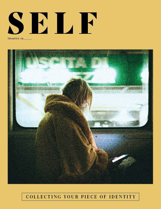
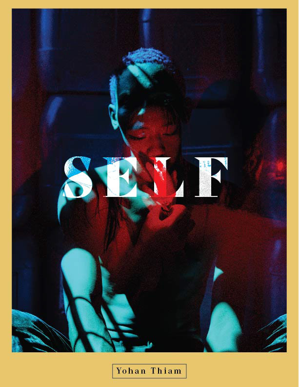
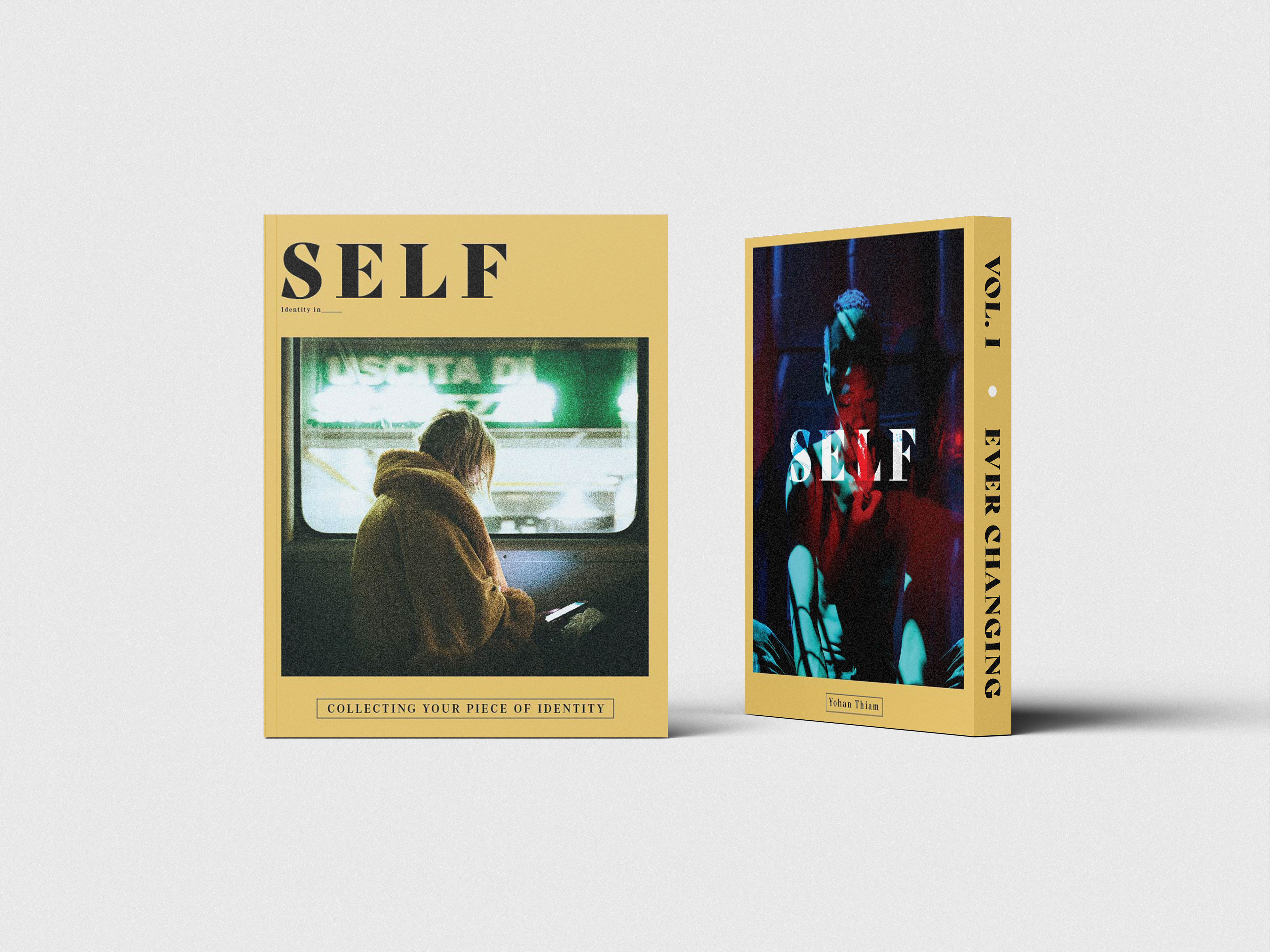
The book's front and back are illustrated with images with specific goals. I wanted them to be relatable and express the anguish people might feel when searching for their Identity.
The first image is one all too familiar, on the phone. We are looking for a distraction away from thoughts and worries. Meanwhile, the second image at the back is a mix of what thoughts and feelings we could have, as our facial expression does not change—a contrast of our inner monologue and what we allow to be seen.
This is another reason why the amount of text is minimal; this is the only part of the design solely focused on the imagery.

Layout
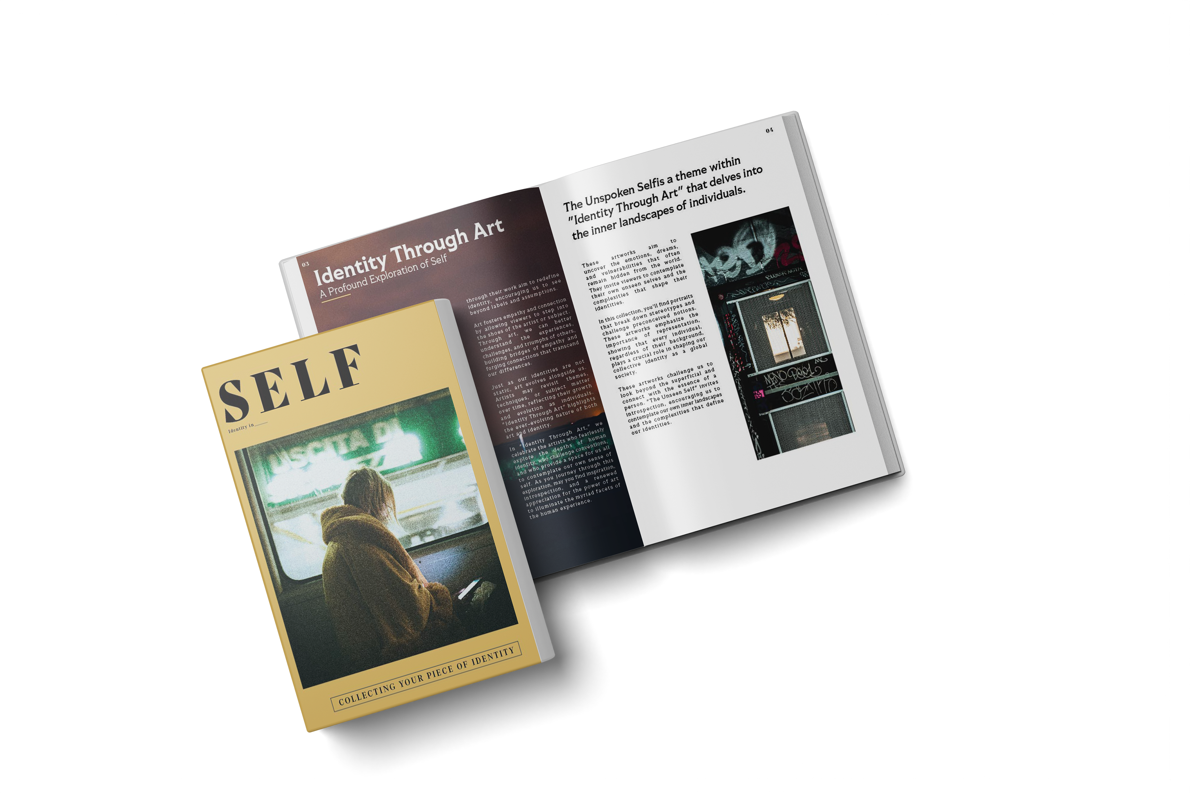
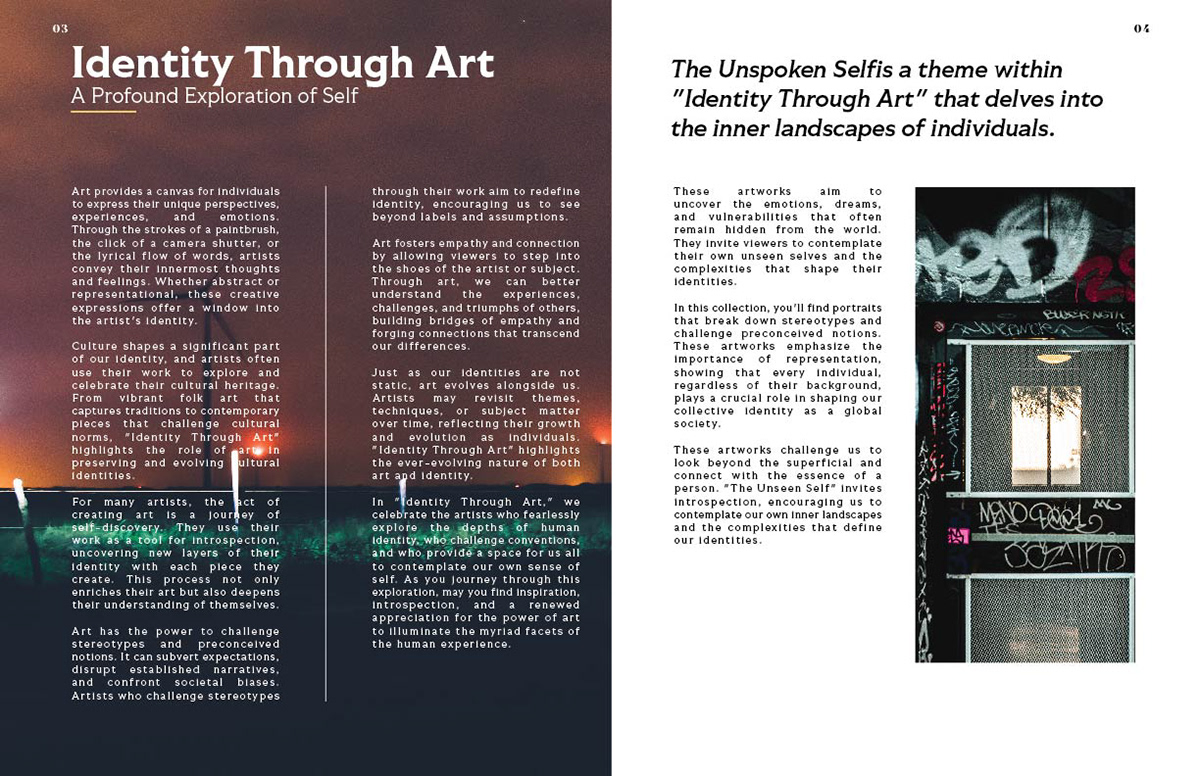
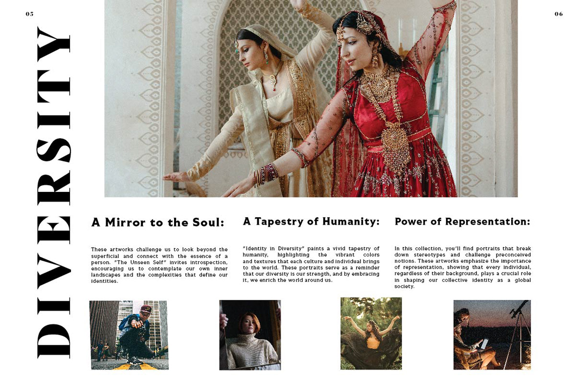
In contrast, the pictures used within the book pages represent a positive aspect of their theme. Relatable without bringing negativity, especially when talking about the concept of Identity. I wanted some of them to also diverge from what is expected. Identity in Art relates more to street art than what we would traditionally think about. In its own right, it is an everyday expression of artistic value and Identity.
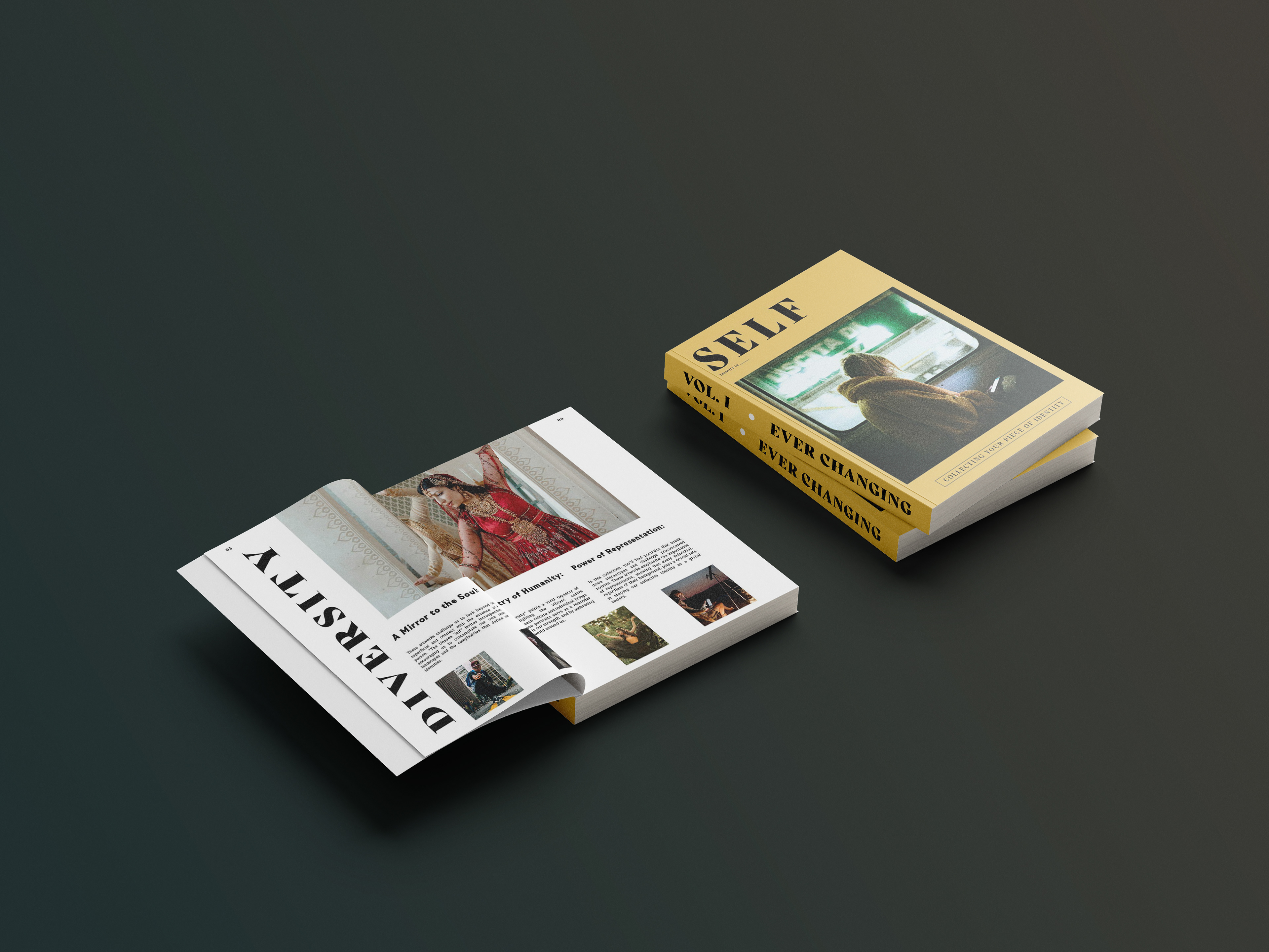
While every page might not look similar, there was a direction and consistency. What I considered necessary was Alignment, Repetition, Contrast, and Proximity.
The pages were all created with the same grids. Grids, though, do not mean limitations. Only some lines start at the corners of the grids. The halfway mark of the rectangle can be a beginning.
It is necessary to constantly be able to have slight similarities in the design while allowing each section to be its individual and unique element.